Clipper tea “ditch the old bag” advertisement

This week I have chosen to analyse the latest advert from British tea manufacturers “Clipper”.

The short 30 second advertisement shows images of couples from all ages and walks of life drinking tea whilst captions such as “she is having an affair”, “so is he” and “she is on her second” appear on the screen.

This initially seems like a strange thing to feature in a tea advert, however it is revealed at the end of the advertisement that the people in the advert aren’t cheating on their significant other’s but more so “cheating” on their favorite brand of tea with clipper teas.

I think this advertisement is successful in a number of ways, firstly I think it is successful in grabbing the audiences attention for the full 30 seconds and also provides a humorous ending which improves the memorability of the advertisement. The slogan “ditch the old bag” at the end of the piece subtly adds to the comedic value of the piece.

I enjoy how initially you are unaware that this is an advertisement for a brand of tea. Although this is apparent at the end of the advert and every time you watch the advert afterwards, this does a good job of retaining the audiences attention as they stay alert to find out what the advert is about.

However this advert isn’t without it’s shortcomings. Firstly I would argue that there is little brand recognition within the advertisement, for example the piece shows a number of couples drinking tea in a number of different scenarios, however it isn’t until right at the very end you see that it is specifically Clipper tea. Whilst this could have been done intentionally so as not to give away the “surprise” at the end of the ad, Clipper run a risk of turning this advertisement into an ad for the category as opposed to the brand. If the audience do not remember that this is an advertisement for Clipper tea then it could become an advert for tea in general and as such the message is lost and often the consumers share of wallet will go to the market leader which ironically is against what the advert is trying to say.

I enjoy how the advertisement used a number of demographics in this to give it a broad appeal, which is probably representative of Clipper’s target audience, however all of the couples were heterosexual; whilst this may be seen as pedantic perhaps Clipper could have considered using a gay couple in one of their examples to give the advert an even broader reach.

Furthermore the final slogan “ditch the old bag” whilst being humorous in for some people may be seen as offensive to other demographics, particularly those featured in the advertisement. In addition, the term “old bag” refers predominantly to women in a negative manner so as a result doesn’t really apply to every example couple used in the advertisement. Whilst this is supposed to be done in a very “tongue in cheek” manner Including a hash tag “#ditchtheoldbag” could potentially leave Clipper open to a P.R crisis should the hash tag gather momentum on social media in a negative manner.

Overall I believe this is a well produced, well executed advertisement. However stronger brand recognition such as more frequent usage of the clipper logo or clipper products within the video would have helped to anchor the brand message down. Furthermore perhaps the use of a different slogan to accompany the advert could have been adopted; whilst “ditch the old bag” is a humorous play on words, Clipper could risk alienating a large female customer base if it was to be deemed offensive.
Chips Ahoy

This advertisement from biscuit manufacturers “Chips Ahoy” to introduce their new line of ice cream inspired flavors of cookies.

This advert for me is successful for a number of reasons. Firstly it appeals directly to the intended audience, children, by using humorous non gender or culture specific characters to create a silly 30 second clip.

The humorous nature of the clip along with the simple theme behind the advert means that the message behind the advert is very clear. “These are our new cookies, they are fun just like this ad”.

I think the message behind this ad has been successfully conveyed as well as brand placement, the chips ahoy logo is seen multiple times at the beginning and the end of the advert, firmly stating that these new exciting flavors of biscuit are from chips ahoy.

Shera Ceiling Boards- Love story Commerial

The advert I have chosen this week is an interesting one for a number of reasons.

Firstly, the product it is advertising, ceiling tiles, is not a particularly exciting one. However an elaborate, completely unrelated story line has been developed around it which draws the audience in and retains their attention right up until the very end when the brand and company are revealed.

The advert is also quite humorous which not only helps the company to differentiate themselves from competition in what could be quite a saturated and homogeneous market. place. Furthermore the humor used in the advert gives it replay and sharing value.

Three Mobile: #SingItKitty Cat advert

Three mobile have made something of a name for themselves in previous years with their unconventional “Silly” integrated marketing campaigns and I would argue that their latest effort the “Singing cat” advert is no exception.

Following on from the success of their previous dancing pony and Christmas pug adverts (below); this ad involves, as Three have worded themselves, a “pedal-pumping songstress” and a “flat-faced dynamo” singing along to Starship’s “We built this city on rock and roll”

This advert is successful to me for a number of reasons. Firstly it has managed to reach success as a funny viral video and still retain repay value and successfully achieve brand recognition. This could have perhaps be because there was so much hype around the Pony advertisement that fans were keen to find out what new crazy idea Three had come up with for their latest ad and as a result instantly associated the advert with the brand. This advert was obviously created for purposes of brand awareness.

As mentioned above, I would argue that this advert has a certain replay value and “Shareability”other viral adverts do not always have. This could be down to the song choice, albeit a rather cheesy 80’s pop song, it is catchy and the use of an older song means that the advert appeals to a slightly older audience. Pairing this with the cute little girl and the funny singing cat also broadens the appeal of this advert which I believe to be a large contributor to its success.

Finally the end statement “we all need silly stuff” is similar to the message of the previous two “silly” adverts they have created. This not only implements a degree of continuity between the ads but also emphasizes their message of trying to appeal to perhaps a younger audience who may be looking for a more accessible, “fun” mobile provider. Using the hashtag to enhance their social media presence and a partner site where the audience can create their own “singing kitty” video means they implemented a rather tidy, innovative integrated marketing campaign that could further appeal to a younger “online” generation.

Pony Ad (2013): http://www.youtube.com/watch?v=Ekr05T9Iaio

Christmas Ad (2013): http://www.youtube.com/watch?v=NLrk259CwMw


Honda Civic Tourer “Inner Beauty” Ad

This week I have chosen to analyze the advert for Honda’s new civic tourer. The first thing you notice when watching this TV spot is how mesmerizing it is. The short film shows a constant line of random objects and what’s inside them, they then all fit perfectly into the back of the spacious boot of the civic at the end. This not only links in nicely with the opening statement, “For those who love the inside as much as the outside”, but also keeps the constant attention of the viewer. From a technical point of view this is especially important when the imagery focuses on the Honda logo, and more importantly, the product.

Another thing that is striking about this advert is how unconventional it is for a car advert. There often seems to be a set of characteristics that are synonymous with advertising cars. (e.g. sweeping long shots of the car driving in exotic locations with closeups of the cars features). Perhaps Honda chose the non conventional route to aim at a younger, “hipper” market? Or perhaps this was done in an attempt to differentiate the brand and product from rivals in a highly competitive market. Either way i think this is a very well made piece and a successful advert.

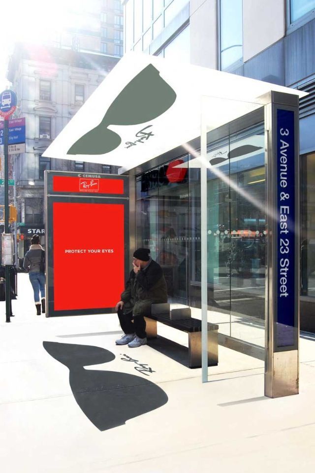
Ray bans Bus stop aesthetic advertising

Ray bans Bus stop aesthetic advertising

For this blog post I have selected a piece of aesthetic advertising by sunglasses brand Ray-bans.

I have selected this advertisement because I believe it is interesting, innovative and does a good job of grabbing the attention of the received audience. Ray bans as a more high end sunglasses brand and therefore I think this unconventional method of outdoor advertising works well in trying to differentiate them from others.

They have also selected a simple, clear message to accompany the shelter of “protect your eyes”. This is interesting as, although it appears alongside the Raybans logo and is up keeping with their red and white brand colours, if focuses more on the functional purpose of the sunglasses as opposed to being fashionable which one could argue is what the Rayban brand is more famous for.

Virgin Active 2014 ’Don’t just live, live happily ever active” ad

For my second blog post I have chosen a very different advertisement; not only in style and purpose to the previous but also because as opposed to promoting a product it is promoting a service offering. I thought that this would create some interesting points for comparison.

The advert in itself is a short montage of active scenes e.g. swimmers, runners, athletes cut with a middle aged looking man driving a motorbike through the desert dressed only in a pair of underpants. The montage is completed with the bold text “Don’t just live, live happily ever active” dominating the screen as it cuts to the virgin active logo and details.

What initially drew me to this ad was how strange it is. Indeed when one watches it for the first time it is difficult to deduce what exactly it is advertising. Although some would argue this is a dangerous tactic for a television advert which should perhaps be obvious as to it’s purpose and what it is “selling” it in fact holds the viewers attention and captures their imagination as to what it is advertising.

Another interesting feature of this advertisement is that it is not like any other advertisement I have seen for a gym membership, or even any other service in the leisure industry. There is not mention of virgin or their leisure centres at all until the very end.

The use of an obscure image such as the man on the motorbike seems random at first, however after watching the advert a few more times it becomes more apparent why this was selected. The man is most likely the target audience for this advert. Considering the time this was released also makes sense as it was around New Years when many people of his demographic may be thinking about a New Years resolution to get in shape.

The advert appeals to a more adventurous type of gym goer, perhaps the selection of an older gentleman was done so as to appeal to men of a similar age who long for their younger years or seek a new challenge and excitement in life? The advert implies that a membership with virgin active isn’t just gym membership but a change in life style, to live “happily ever active”.

Guinness Wheelchair Basketball Advertisement

I have selected this advert from late 2013 for a number of reasons.

Firstly because I am a fan of the advertising activity undertaken by Guinness. The different and often surprising nature of their advertisements go a long way to help establish and uphold their iconic brand image by marketing Guinness as a drink for the “adventurer”, “the creative”, “the dreamer” something a little bit different from the norm. Indeed this is exemplified excellently by the title of the campaign to which the advert belongs “Made of More”.

Secondly I selected this advertisement because I believe this is a very striking and effective piece which, as mentioned above effectively conveys the intended brand image whilst also creating stopping power.

Furthermore they have taken to bold strategy to target emotional appeals in order to reach their audience. It could be argued that this is quite uncommon for beer (or stout) advertisers who usually go down the comical route or create a visual spectacle to get around the very strict legislation surrounding alcohol advertising.

This is even more uncommon when one considers that this advertisement is aimed mostly at the male population, the drink Guinness is predominantly consumed by males, the advertisement features all males, the singer on the track used is male as is the actor providing the voice over. The concepts behind male friendship is not one often explored in advertising and it could be argued that (without sounding terribly outdated) that these are often themes used more frequently in advertisements aimed towards females.

The shock value at the end adds to the impact and stopping power of the add, revealing that only one of the men featured in the ad is actually disabled whilst the rest are friends of his that have made the decision to start playing wheelchair basketball so as to avoid excluding him and to express their empathy towards him. This is supported well by the simple dialogue used in the voice over “Dedication. Loyalty. Friendship. The choices we make reveal the true nature of our character. ”

Indeed the simplicity of the advert is what makes it so successful as the message stays clear and at the forefront of the piece. It would be interesting to see whether the idea of disabled athletes was selected by Guinness due to the success of the recent London Paralympics which reached record viewing figures worldwide.

Overall this is a very well executed piece of “advertainment” which not only fulfilled the objectives laid out by the marketing manager but also provided us with one of the most thought provoking, emotive advertisements of 2013.